| |
|
|
| |
| Some formula |
| |
| \(\begin{aligned} &\text{Size of class interval}= \frac{\text{Largest data value $-$ Smallest data value}}{\text{Number of classes}} \end{aligned}\) |
| |
| \(\begin{aligned} &\text{Lower boundary}=\frac{\text{Upper limit of the class before it $+$ Lower limit of the class}}{2} \end{aligned}\) |
| |
| \(\begin{aligned} &\text{Upper boundary}=\frac{\text{Upper limit of the class $+$ Lower limit of the class after it}}{2} \end{aligned}\) |
| |
| \(\begin{aligned} &\text{Midpoint}=\frac{\text{Lower limit $+$ Upper limit}}{2} \end{aligned}\) |
| |
|
|
| |
| Example 1 |
| |
| The data below shows the heights, to the nearest cm, of a group of Form 5 pupils. |
| |
| \(\begin{aligned} \begin{matrix} 153 & 168 &163 &157\\ 158 & 161 &165 &162\\ 145 &150 &158& 156\\ 166 &163 &152& 155\\ 158 &173& 148 &164\\ \end{matrix} \end{aligned}\) |
| |
| a) Determine the class intervals for the data, if the number of classes required is 6. |
| b) Construct a frequency table based on the information in a). Hence, complete the frequency table with the lower limit, upper limit, midpoint, lower boundary and upper boundary. |
| |
| Solution: |
| |
| \(\begin{aligned} \text{a) }&\text{The largest data is 173 and the smallest data is 145.}\\ &\text{If the number of classes is 6, then the size of each class interval}\\ &=\frac{173}{145}\\ &=4.7\approx 5.\\ &\therefore\text{The class intervals are 145 – 149, 150 – 154, 155 – 159,}\\&\text{ 160 – 164, 165 – 169 and 170 – 174.} \end{aligned}\) |
| |
b) 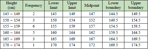 |
| |
|
|
| |
| What is cumulative frequency? |
| |
| The cumulative frequency of a class interval is the sum of the frequency of the class and the total frequency of the classes before it. This gives an ascending cumulative frequency. |
| |
|
|
| |
| Example 2 |
| |
| Construct a cumulative frequency table from the frequency table below. |
| |
| Age |
10-19 |
20-29 |
30-39 |
40-49 |
50-59 |
| Frequency |
4 |
5 |
9 |
8 |
5 |
|
| |
| Solution: |
| |
| Age |
Frequency |
Cumulative frequency |
| 10-19 |
4 |
4 |
| 20-29 |
5 |
9 |
| 30-39 |
9 |
18 |
| 40-49 |
8 |
26 |
| 50-59 |
5 |
31 |
|
| |
|
|
| |
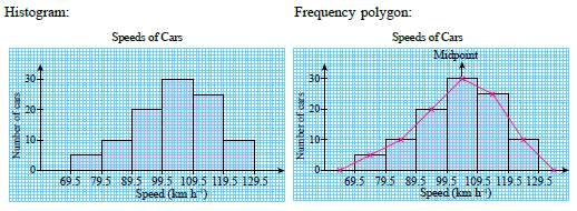
| What is histogram? |
| |
| Histogram is a graphical representation in which the data is grouped into ranges by using contiguous bars. The height of the bar in histogram represents the frequency of a class. |
| |
| Steps for constructing a histogram: |
- Find the lower boundary and upper boundary of each class interval.
- Choose an appropriate scale on the vertical axis. Represent the frequencies on the vertical axis and the class boundaries on the horizontal axis.
- Draw bars that represent each class where the width is equal to the size of the class and the height is proportionate to the frequency.
|
| |
|
|
| |
| What is frequency polygon? |
| |
| A frequency polygon is a graph that displays a grouped data by using straight lines that connect midpoints of the classes which lie at the upper end of each bar in a histogram. |
| |
| Steps for constructing a frequency polygon: |
- Mark the midpoints of each class on top of each bar.
- Mark the midpoints before the first class and after the last class with zero frequency.
- Draw straight lines by connecting the adjacent midpoints.
|
| |
|
|
| |
| Example 3 |
| |
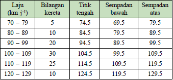
| The frequency table below shows the speed of cars in \(\text{km h}^{-1}\), recorded by a speed trap camera along a highway in a certain duration. Represent the data with a histogram and frequency polygon by using a scale of 2 cm to 10 \(\text{km h}^{-1}\) on the horizontal axis and 2 cm to 10 cars on the vertical axis. |
| |
| Speed \((\text{km h}^{-1}) \) |
70-79 |
80-89 |
90-99 |
100-109 |
110-119 |
120-129 |
| Number of cars |
5 |
10 |
20 |
30 |
25 |
10 |
|
| |
| Solution: |
| |
 |
 |
| |
|
|
| |
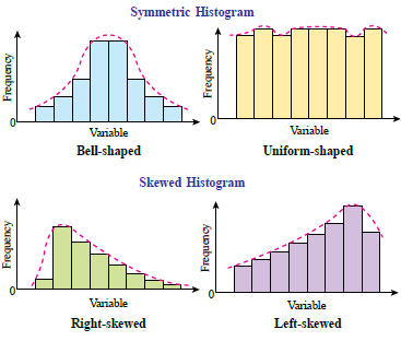
| Distribution shapes of data |
| |
| When describing a grouped data, it is important to be able to recognise the shapes of the distribution. The distribution shapes can be identified through a histogram or frequency polygon. |
| |
| Common distribution shapes are as follows: |
| |
 |
| |
|
|
| |
| What is an ogive? |
| |
| A cumulative frequency graph, also known as an ogive. When the cumulative frequencies of a data are plotted and connected, it will produce an S-shaped curve. Ogives are useful for determining the quartiles and the percentiles. |
| |
| Steps for constructing an ogive: |
- Add one class before the first class with zero frequency. Find the upper boundary and the cumulative frequency for each class.
- Choose an appropriate scale on the vertical axis to represent the cumulative frequencies and the horizontal axis to represent the upper boundaries.
- Plot the cumulative frequency with the corresponding upper boundary.
- Draw a smooth curve passing through all the points.
|
| |
|
|
| |
| Quartile |
| |
| For a grouped data with number of data \(N\), the quartiles can be determined from the ogive. \(Q_1\), \(Q_2\) and \(Q_3\) are the values that correspond to the cumulative frequency \(\begin{aligned} \frac{N}{4} \end{aligned}\), \(\begin{aligned} \frac{N}{2} \end{aligned}\) and \(\begin{aligned} \frac{3N}{4} \end{aligned}\) respectively. |
| |
|
|
| |
| Example 4 |
| |
| The frequency table below shows the salt content of 60 types of food. |
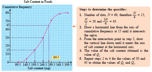
| a) Construct an ogive to represent the data. |
b) From your ogive, determine
(i) the first quartile
(ii) the median
(iii) the third quartile |
| |
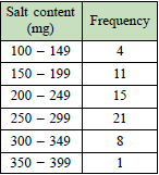 |
| |
| Solution: |
| |
a) 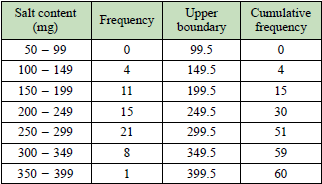 |
 |
| |
| b) \(\begin{aligned} &\frac{1}{4}\times 60 = 15\\ &\text{From the graph, the first quartile,}\\ &Q_1 = 199.5 \text{ mg}.\\\\ &\frac{1}{2}\times 60 = 30\\ &\text{From the graph, the median,}\\ &Q_2 = 249.5 \text{ mg}\\\\ &\frac{3}{4}\times 60 = 45\\ &\text{From the graph, the third quartile,}\\ & Q_3 = 284.5 \text{ mg} \end{aligned}\) |
| |
|
|
| |
| Percentile |
| |
| A percentile is a value that divides a set of data into 100 equal parts and is represented by \(P_1,P_2,P_3,\dots,P_{99}\). |
| |
|
|
| |
| |